
Applying a design theme to your partner portal
Themes let you restyle your affiliate partner portal in one click. Instead of adjusting colors, fonts, and layout individually, you can pick a professionally designed starting point and fine-tune from there.
What is a theme?
A theme is a curated bundle of design settings: colors, fonts, layout, corner style, navigation style, and the login/signup sidebar. Applying one updates all of those settings at once so your portal instantly gets a cohesive look.
Themes are a starting point: after applying one, you can still adjust any individual setting in the other Live Designer tabs.
How to apply a theme
- Go to Partner portal → Edit Design (Live Designer).
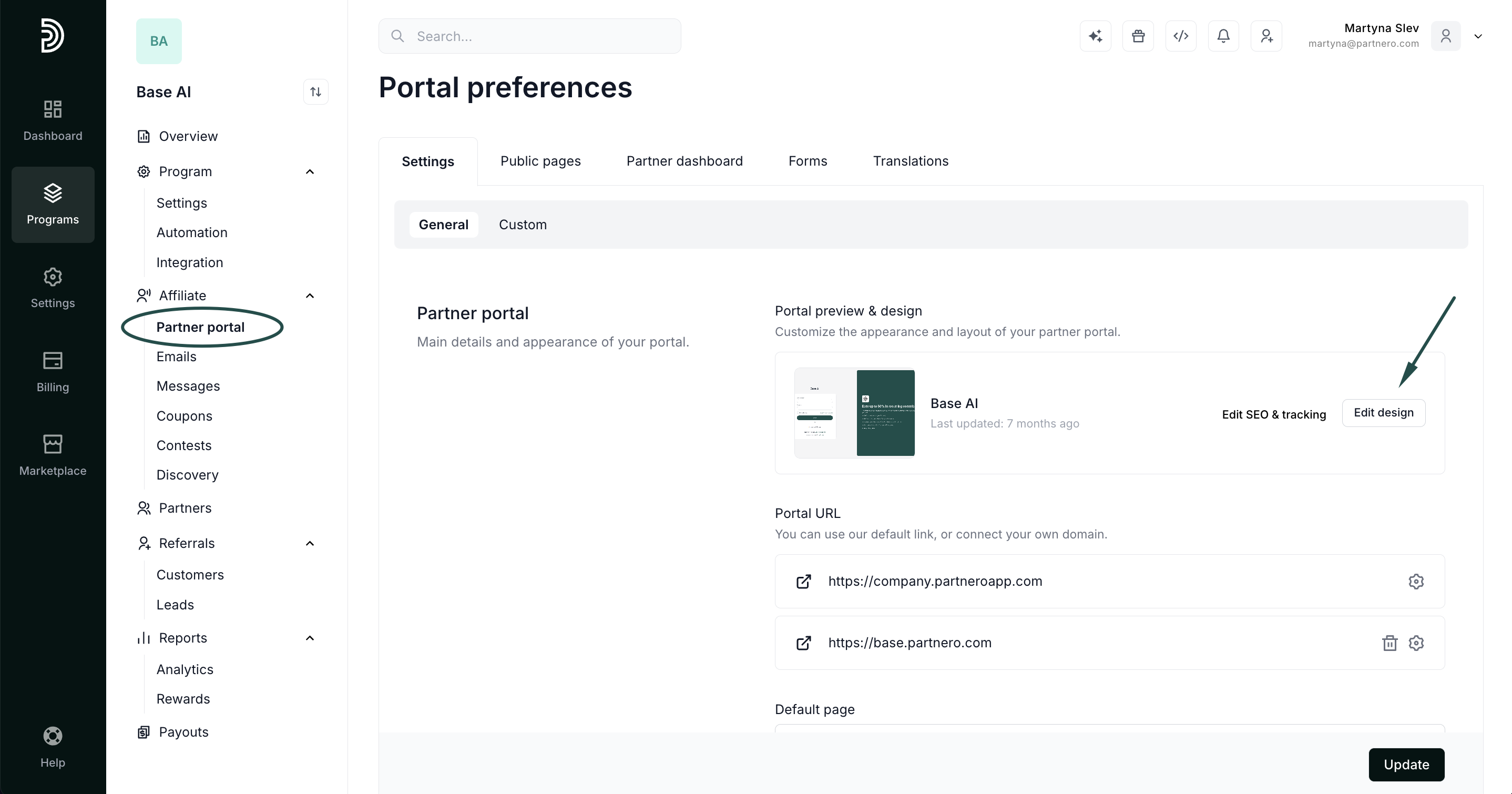
- Select the Themes tab.
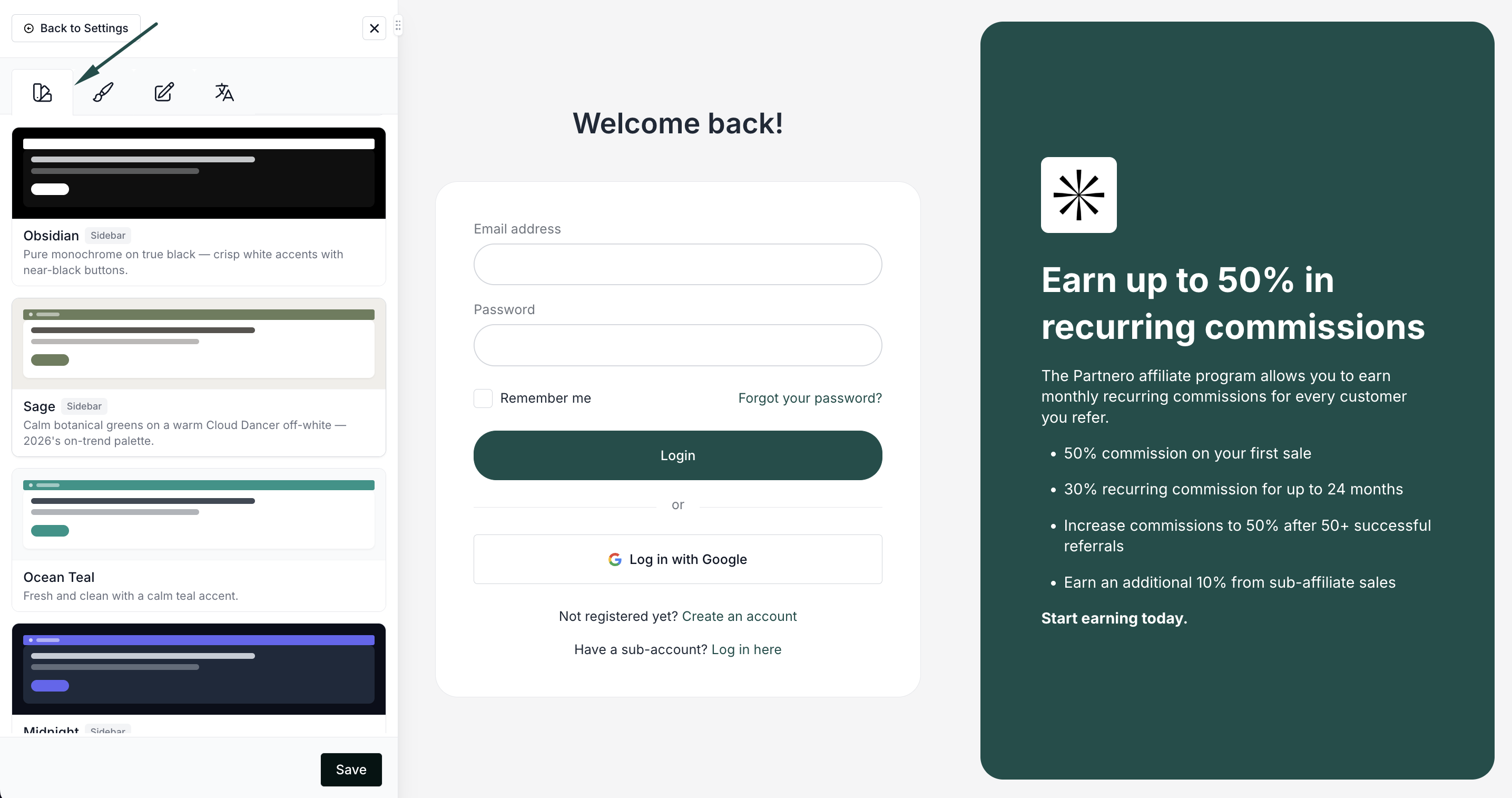
- Browse the theme library and click a theme to apply it. Your portal preview updates immediately.
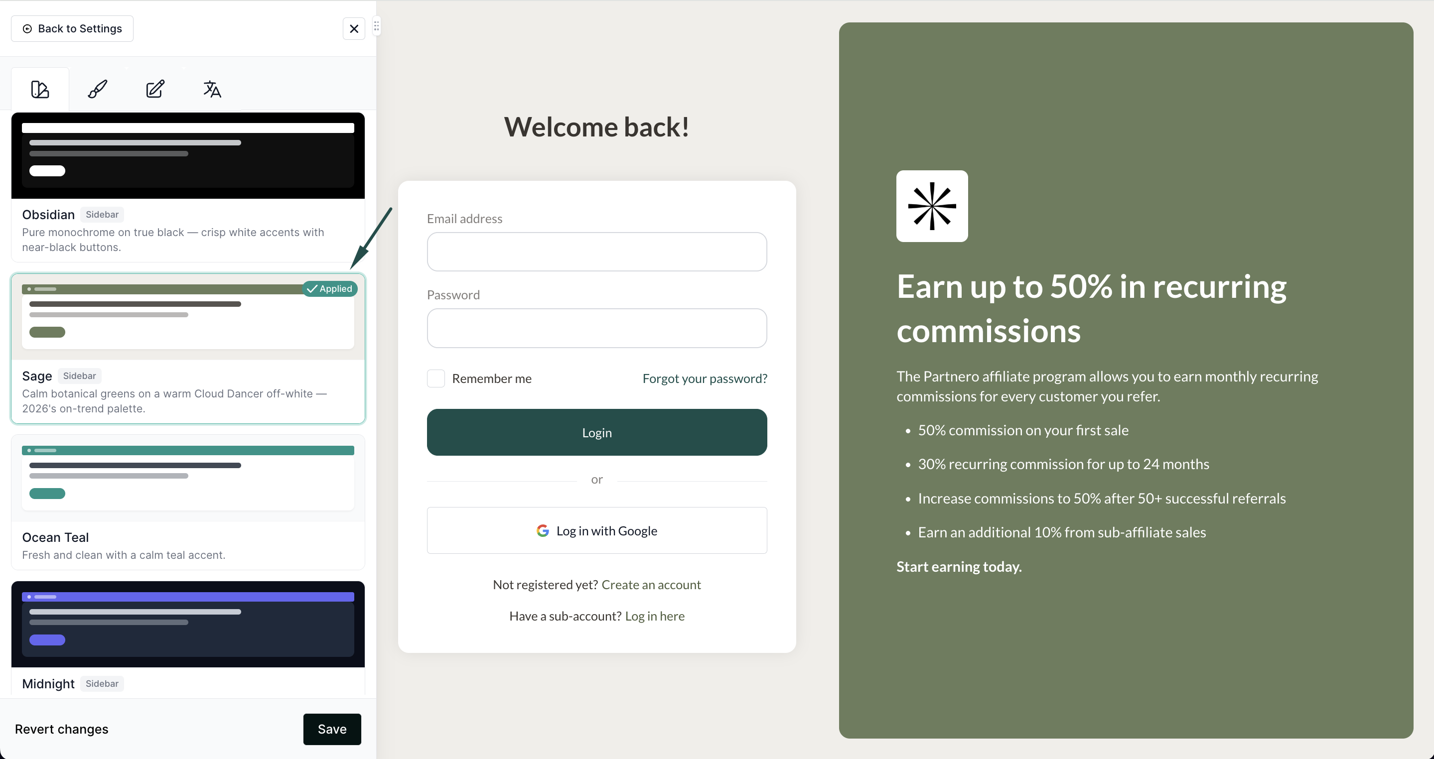
- Optionally, fine-tune colors, fonts, or layout in the Branding, Colors, and Layout tabs.
- Click Save to publish your changes.
Changes are only visible to your partners after you click Save. Until then, you're free to preview and switch between themes.
What gets updated and what's kept
Updated when you apply a theme:
- Brand color, link color, and button color
- Font family
- Dashboard layout, card style, and corner rounding
- Navigation color and link style
- Login and signup page sidebar
Always kept:
- Your logo and any uploaded images
- Your content and translations
Light and dark themes
The library includes both light themes and true-dark themes (such as Onyx, Obsidian, and Midnight). Dark themes automatically adjust dashboard elements such as cards, inputs, and text for readability on a dark background.